One of the things you discover when doing competitive research across a retail vertical market is how skilled our industry has become at usability — and how much further we could go in branding. During the 1990s, when web design was in its infancy, most business websites were brochures: heavy on branding, with almost no interactivity, and little […]
The USHMM website, the worlds leading online authority on the Holocaust, is available in 16 languages, and was visited in 2015 by more than 16.5 million people representing 211 countries and territories. Being chosen to redesign this culturally and historically significant website was a profound and deeply humbling honor.
Web fonts changed everything in designincluding how type houses made and sold their products. We helped Monotype get web fonts to market ahead of the curve, and helped their brand reconnect with designers.
Who created all these websites? What were their job titles, ages, genders, ethnic backgrounds, and compensation levels? In 2007, nearly 20 years into the webs existence, there shockingly wasn’t a byte of data to be found about its makers. We set out to fix that.
When founder Matt Mullenweg approached us to redesign WordPress, he wanted more than a pretty new skinthe entire user experience was up for review. Were huge fans of this open source blogging software and relished diving into the project.
Seeking new audiences, AIGA asked us to redesign its website from top to bottomspanning membership areas, magazine sections, and more than a decade of deep content. Our architecture combined content-driven logic with pure creative inspiration.
The W. W. Norton website was divided into three siloscollege, trade, and professionalmaking it difficult for any single user to understand the breadth of Nortons offerings. Our new site presented Norton as a single company with three departments, while making it easy for each user to find the books she came for.
We designed and built the New York Times Crosswords tutorial with gamification in mind. After all, what better way to learn the game than by playing it? Our interactive tutorial highlights different sections of the crossword puzzle and explains tools unique to NYT Premium Crosswords.
Like so many sites, Amnestys had grown organicallyand somewhat haphazardlyover the years, Internal priorities had often dictated its architecture, rather than an analysis of user needs. We stepped in to fix that and further develop the brand.
Ma.gnolia was a social bookmarking tool with features well ahead of its time. Through research and innovation, we designed the product and developed innovative features for the client.
UFA is the worlds premier developer of Air Traffic Control simulation systems, but their site wasnt doing all it could to tell their story. We designed them an accessible, responsive platform to lead with their strongest brand attributes, romance their high-tech offerings, and qualify prospectsa system that will grow as they do.
Our first mission for this sustainable bike builder was to achieve social proof while building a mailing list. We delivered a single-serving site that doubled as a contest. During the contest, we designed and launched the full site, one as clean and minimal as Brilliants cycles.
Clients like Vogue, Elle, and Nike seek out this top-tier fashion photographer. Weve constructed three sites for him over the yearsdesigns that work invisibly, despite their complexity. His work is free to speak for itself, loud and clear.
For this innovative publisher, we crafted a writing-focused social media network seemingly designed and written by characters from the Amanda novels. Readers entered the novels world by joining the search for Amandafollowing clues and reading passages that only existed onlinehelping to shape the narrative across eight novels.
Helping people become more eco-conscious (without making them feel guilty) was the goal of the social network we designed for Brighter Planet. The site went into public beta on 16 July 2009 and ran for seven years.
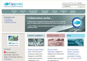
With operations in more than 30 countries, Capgemini is a global consultancy that treats its blue-chip clients as collaborative partners. This emphasis was central during the companys rebranding, so we fused in into every aspect of its redesigned site.
Our site redesign for Advertising Age was more than a simple update; we redefined user experience and injected modern best practices. Our work brought consistency and predictability to the navigation and layout (including ad sizes), and introduced variable homepage template formattinggranting site editors and art directors the flexibility long enjoyed by their print-side colleagues.
The creators of Dictionary.com and Thesaurus.com (each the most-visited site for those resources) tapped us to redesign their products, and to solve tricky problems common to most long-running websites.
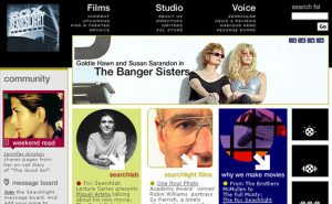
Co-created with Hillman Curtis Inc., our redesign provided cinephiles with extensive, insightful content by people who make and love movies. Designed for ease of use, ease of reading, and easy client updating and maintenance, the site loaded fasteven over dial-up.
Over the years, weve designed, consulted on, or created special content for Warner Bros. sites, including Mars Attacks, Batman Forever (the most popular website of its time), and Space Jam. The site for Charlotte Gray, a film exploring ordinary peoples choices and heroism during wartime, reflects our involvement.
Googles acquisition of Blogger helped take blogging mainstream. Our work (and that of our colleagues) launched millions of standards-compliant sites onto the web at a time when there were virtually none. It fulfilled the promise that anyone could have a website.
This 2006 project was among our first involving content strategy in addition to design and development. We designed a full range of tonalities for the sites messagingfrom light-hearted quips to an appropriately-serious tone for medical information.
Years before leading corporations and government organizations began doing it, we collaborated with New York Public Library leadership to create one of the web industry’s first online style guides. The project’s scope also included the design of various content sites, and we trained Library employees in standards-based design.
UNIFEM (the United Nations Development Fund for Women) worked to foster womens empowerment and gender equality throughout the world. We support this organization and are honored we had the opportunity to redesign its site.
Top-drawer coach. Winning athletes. Passionate fans. The Kansas City Chiefs had everything but a clean interface and flexible publishing system for their web, marketing, and content staff. They needed a “big play,” so we delivered exactly what they needed.
As the companys first studio of record, we strategized, designed, and built their corporate website from scratch, later doing the same for two product sites. Our extensible design platform ensures that future products can have their own sites in the system.
A favorite of discerning architecture firms and contractors, Siberian Wood Floors chose us to translate its showroom experience into an online experience, complete from aesthetics to usability.
Clear Channel’s GetAccess was a member site for fans of live music and events. The extensible platform was customized by region and on a continual roll-out schedule. New versions retooled to meet specific brand and business objectives.