Design is a verb: Redefining Dictionary.com.
In 2006, Lexico Publishing Group, creators of Dictionary.com (the most-visited online dictionary) and Thesaurus.com (the most-visited online thesaurus), tapped us to redesign their popular reference network.
By coming first and being best, the network had earned a huge following. But after more than a decade online, Lexicos brand identity and site structure had begun to lose focusand the company was losing market share to younger competitors.
Problems of long-running successful sites
Lexicos problems were typical of large, long-running web content properties that have grown in an organic (but also somewhat haphazard) manner, year after fast-paced year.
Its advertising acceptance policy had become loose and somewhat vague. This in turn created inconsistent column widths from one page to the next, causing visitors to wonder if they were still on the same network of sites. URL redirects did little to reassure new users that they had come to the place they intended. Subtle, unconsidered differences between network logos further lessened the sense of brand cohesion. Although it was doing many things right, Lexico needed help.

First restructure, then redesign
We reorganized the multi-site networks URL structure so that first-time users would feel safe and the connection between sites would be clear. Analyzing the multiple sites numerous capabilities from the point of view of users, we were able to surface features that had always been present but were rarely used because nobody knew about them.
We brought a new level of uniformity to advertising and page layouts. To the extent that we could do so, we also brought hierarchy and coherence to page typographya critical improvement, given that Dictionary.com and its siblings are text-driven applications. We freshened and tightened the brand identifiers, too, making site logos work better as a group, while changing as little else as possible.
Next, we updated the color scheme and deepened its logic to make the related sites feel more like a family, again keeping change to a bare minimum. We then replaced the sites aging markup with clean semantic structures styled via smart CSS.
The benefits of good design
After our redesign, Dictionary.com and its sister sites delivered a smoother, smarter, more consistent user experience. Customer feedbackeven from long-term users, who typically dislike changewas overwhelmingly positive. Shoring up the loyalty of existing users was the first step toward growing market share. It also caught the attention of investors and buyers.
Six months after we redesigned dictionary.com, the company sold for roughly three hundred times our feeproof that design is not an expense, its an investment.
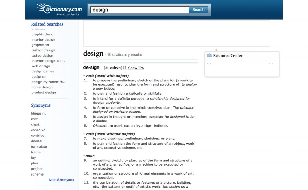
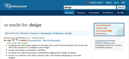
Two years later, the purchaser redesigned the site again. The present Dictionary.com does not reflect our work, but you can visit the archival site to get a notion of what we created. (Modern elements of the site, designed subsequent to our work, get pulled into the archival site, creating an experience that is not what we designed, exactly, but is as close as one can come to it today.)
Our responsibilities on this project
Research; strategy; information architecture; brand design and consulting; graphic design; user interface design; user experience design; CSS/HTML template development. The redesign launched 21 August 2006.