Making Search work harder: W. W. Norton

Norton & Company is the oldest and largest publishing house owned wholly by its employees. Norton has published literary classics by authors ranging from Sigmund Freud and Bertrand Russell to Rita Dove and Stephen Jay Gould.
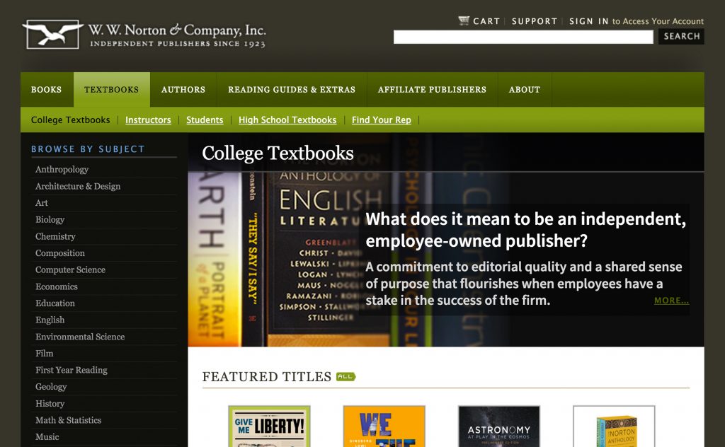
When the publisher approached us, the W. W. Norton website was divided into three siloscollege, trade, and professionalwhich made it difficult for any single user to understand the breadth of Nortons offerings. Our new site would present Norton as a single company with three departments, while making it easy for each user to find the books she came for.
The new site had to communicate that Norton is a modern company with an extraordinary history of publishing books not for a single season, but for the years. It was important that the redesign position Norton as web-savvy without diminishing its heritage and the authoritative, classic aspects of its brand attributes. This is the kind of challenge we love best.
First, do your homework
We began with an expert evaluation of usability issues, detailing strengths and weaknesses of the companys site, and identifying stakeholder priorities and audience needs.
In our research, Norton stakeholders often likened publishing houses to film studios or record labelswhile its critical to the success of a work, its largely invisible to the public. Except to an academic audience, Norton was largely invisible and silent. We made a virtue of that anonymity. If Norton was for book lovers, the new site needed to get out of its own way while readers enjoyed clear pathways to its books.
The big overhaul
Our top-down and bottom-up structural redesign stopped forcing unnecessary choices on users, and to rather looked for common denominators across the silos. Students are not often professionals; instructors are not often students; and professionals are often not involved with a college. But all audiences are book readers, and all site users are book lovers (or potential ones). We used that common denominator to present an experience that worked for all audiences.
While traversing the existing Norton site, consumers faced 17 different navigation systems. That was 16 too many. We consolidated disparate navigation systems, bringing usefulness and grace to an otherwise motley collection of links and labels.
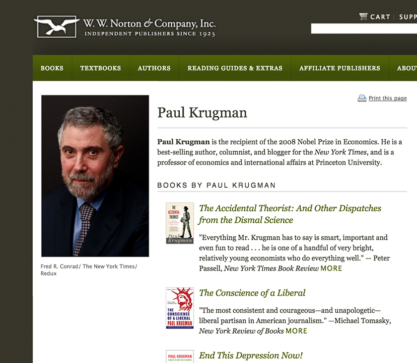
We created a consistent Book Detail template that is flexible enough to be used across all areas and uniform enough to provide a predictable user experience. The way we saw it, the structure of Nortons website should not be surprisingthe wonderful details of the book should be.
We clustered rich media around each book, and created structures that made heroes of the books and their authors. Maybe its just us, but we figured that when a web user googles a Norton title or author, a Norton website page should be among her top search results.
Make Search work harder for users and client
Speaking of Search, we fixed that, too. By default, we provide a keyword search field, with a results page that defaults to the most relevant search results. We allowed users to search across trade, professional, college, and sub-sites, such as ebooks. On search results, we allowed users to refine their searches by allowing them to sort by title, author, and pub date, or allowing them to filter by books with ancillary materials.
Further, we helped Norton start using search patterns to inform the editorial choices they make on the site. For instance, the books that Norton chooses to promote on site Landing pages and the Homepage can be a result of popular queries or swift changes in search patterns.
Bringing it to Life
With every detail of the user experience in place, we set about creating a design to communicate Nortons rich heritage while also feeling fresh and unexpected. The content for each template type was carefully and strategically considered. Every word counted. Every piece of copy had to communicate the Norton brand and help readers make informed choices (without overwhelming them with choice).
Our responsibilities on this project
Usability audit; competitive audit; content strategy; user experience design; information architecture; graphic design; user interface design, CSS/XHTML template development. Launched 1 June 2009.