Plain speech and relatable mental models: Redesigning Capgemini Worldwide
Headquartered in Paris, France and operating in more than 30 countries, Capgemini is a global consultancy that treats its blue-chip clients as collaborative partners. Many companies talk about that kind of partnership, but Capgemini actually means it.

Working in tandem with Stopdesign, we redesigned Capgeminis site to reflect the companys commitment to collaborative partnership.
Live the brand in every detail
Collaborative partnership was key to the companys rebranding; we took this idea to every level of the site. Reflecting collaborative partnership meant preferring natural language to buzzwords and consultant-speakeasy to spot in something as basic as the navigation menu. Instead of categories based on corporate structures and sales divisions, we used clear, ordinary language to connect the visitors needs to the companys services.

Innovative navigation paints a mental picture
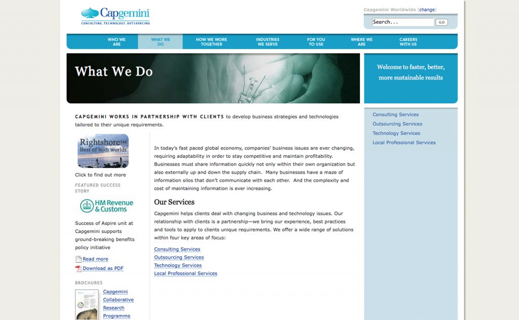
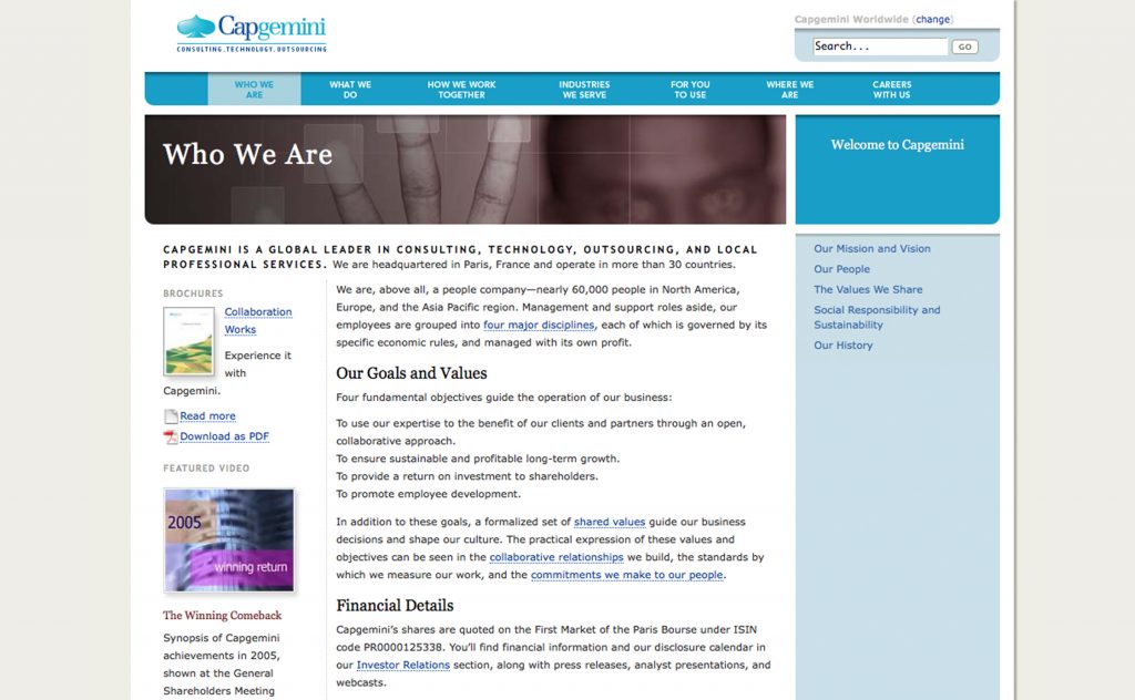
In place of the heinous drop-down menus that users hate (but were somewhat expected at the time of the design), our information architecture introduced something we called spectrum navigation. You can see it in the screenshot, and view it in action on this archived Automotive page. As content becomes more granular, sidebar hues reflect the depth of the path as the visitor explores more deeply into specific topics. Like spark-lines and progress bars, our innovative navigation helps visitors form a mental model of the sites architecture and track their location within it.

While the spectrum lets visitors drill up or down with a click, sibling linkage is handled contextually. The combination of spectrum navigation and contextual linkage is featured in the main content area of each page, replacing the previous sites tedious and poorly usable drop-down menu structure.
Likewise, the open, spacious visual design allows visitors to scan or dive into a tremendous amount of data without clutter or confusion. Not only is it one of the cleanest designs in the category, it is also among the first to use standards-based semantic XHTML and CSS layout, and include special features like smart type sizing. Choosing a page at random, visit this archived Industries page and use your browsers built-in size widgets to make the text bigger. As the text enlarges, so does the container for the header graphic. The site is filled with touches like thesetouches predating Responsive Web Design by about five yearsthat helped make the site more accessible. (Enlarging type helps low-vision users; not breaking the layout while doing so helps everyone.)
All this and content, too
Human-friendly information architecture and design are all well and good, but what happens when marketing begins to fill the site with copy? We created strict content guidelines to help Capgeminis in-house staff find and eliminate vagueness and buzzwords, replacing them with informal, yet businesslike, language that reinforces the companys emphasis on true collaborative partnership.
(In a subsequent content engagement, Capgemini requested our help creating page after page of copy their plain-speaking brand requires. Yes, we do that, too.)
Last but not least, we designed and built a powerful and versatile custom content management system for the new site. Powered by PHP and housed on low-cost, reliable Unix servers, the system did everything a modern CMS should do. It included such niceties as contextual help, and supported the sites sophisticated use of web standards.
Our responsibilities on this project
Brian Alvey designed the custom back-end system. We, along with Stopdesign, conducted research, information architecture; graphic design; user interface design; user experience design; editorial consulting; content guideline development; content strategy; writing; editing; style guide development; CSS/HTML template development. Launched 17 May 2005.
Needless to say, Capgemini has redesigned several times since then, but you can get a partial glimpse of our beautiful work by visiting the archived site.