
Bringing UX to an open source platform: Redesigning WordPress
Were huge fans of WordPress, the open source blogging software powered by web standards. From the blogs of the New York Times to amateur homepages featuring goofy cat pictures, WordPress is used on hundreds of thousands of sites read by tens of millions daily. It is the largest self-hosted blogging tool in the world.
When founder Matt Mullenweg approached us to redesign WordPress for an upcoming, significant version 2.5, he wanted more than a pretty new skin. The entire user experience was up for review.
A matter of clarity
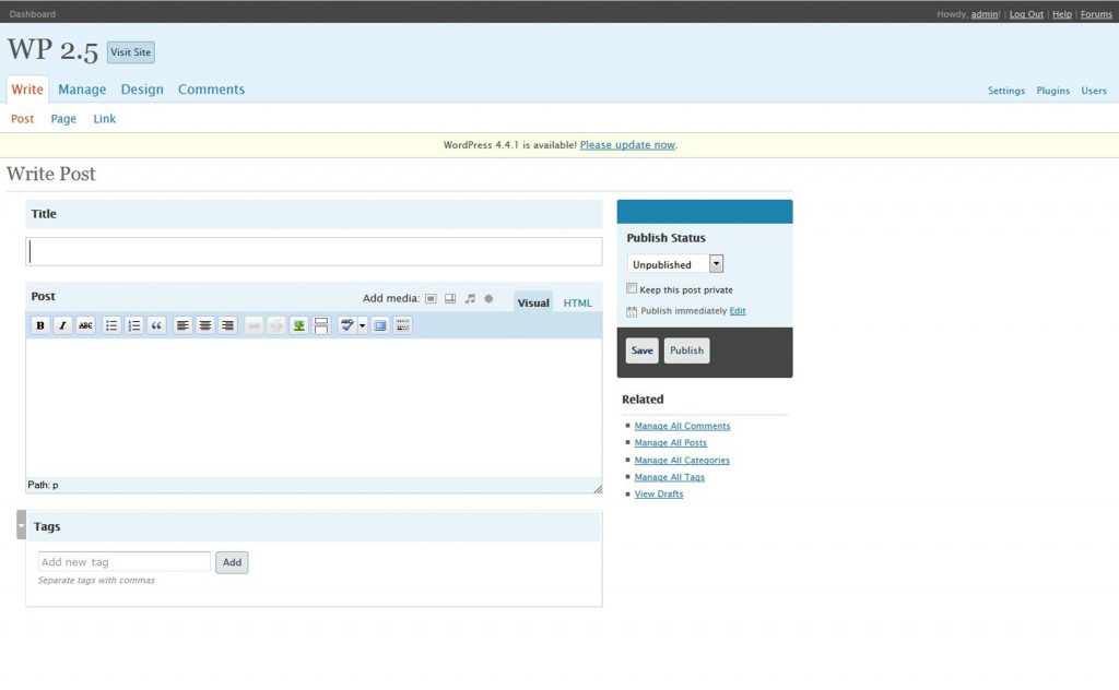
WordPress was designed to get out of a writers way while providing powerful features. But, as often happens with software updated by many hands, some of WordPresss initial simplicity and clarity had gotten lost as new features were added over the years. Navigational labels and admin site structures had evolved organically; there was a randomness and unpredictability to everything, from the location of key functions to the number of items in the navigation menu. It evolved without regard for sustained user testing or serious information architecture.
Working with its users and developers, we conducted research to understand how people used WordPress. In response, we crafted optimally-usable architectures. Based on user needs and competitive analysis, rigor was applied to existing features, while new features were integrated into the emerging fabric.
In short, we constructed a revised information architecture that is more about the user than it is about WordPress. In the old WordPress, navigation was without hierarchy. Important activities to the user, such as writing a new blog post, sat right alongside less important administrative ones. Likewise, the old Dashboard was dominated by WordPress-specific news.
Sure, users enjoyed getting updates on WordPress peripherally as they zipped past to manage comments or write a new post, but this front page didnt help them understand what was really important to them: their website. We evaluated and prioritized the top tasks most users perform, then mirrored that in the navigation and dashboard.
For example, while an advanced user could manually edit the slug of a post via a field in the right sidebar whose location was random and draggable, no provision was made for the less-savvy user. But on top of that, no user could learn the final URL of a post until after it was publishedunless willing to perform URL-hacking gymnastics.
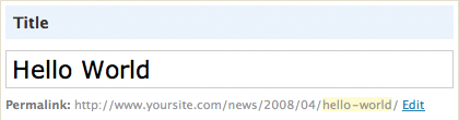
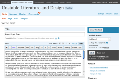
We took care of that in the new WordPress. After you compose a title, a field containing editable text appears under the title to indicate what the final URL will be. Users can edit the URL as they see fit. As users grow accustomed to seeing the URL field appear each time they write a title, they will gain knowledge that turns them into advanced users.
A clear design
As s architecture removed cobwebs, fresh design brought clarity and ease of use to the sites look and feel. It had previously been developer-driven, but the new look was a smooth evolution of the old WordPress design, not a painful rupture from it. Hierarchy, clarity, and other elements of good design were incorporated without cheating. The same constraints forming the underpinnings of earlier WordPress designssuch as the need to use HTML rather than images and Flashremain in place. Design ideas also fed back into architecture and research, in a creative loop that is only possible with small teams.
Although the WordPress admin design has evolved since leaving our hands in 2008, we are delighted to see how many of our user-focused design innovations and corrections have become standard parts of the interfacehelping to account for the platforms continuing growth and popularity.
Our responsibilities on this project
Research and development; usability testing; information architecture; brand design and consulting; graphic design; user interface design. Launched 29 March 2008.

