
Brand enrichment and content streaming: Amnesty International USA

Way back in 2004, we redesigned the site of leading human rights organization Amnesty International USA. Amnesty performs research and takes actions to end or prevent abuses to human rights around the globefrom violence against women in the Middle East and North Africa, to the execution of minors and mentally ill prisoners in the U.S.
Problem: Too much content
Amnesty is the definitive resource for people who want to make a difference. But, like many large content sites, Amnestys had grown organically and somewhat haphazardly over the years, its architecture dictated by circumstance and internal priorities rather than analysis of user needs.
Although the site offered unsurpassed information and support, not everyone who visited could find what they were looking for, reducing participation and diminishing new memberships.

Solution: Commitment-based navigation
We distributed Amnestys content along a three-part arc based on the visitors level of commitmentfrom the merely curious (LEARN) to the passionately engaged (ACT). The categories and their relationships to one other are transparently intuitive, making it easy for first-time and experienced visitors alike to know where to look. We also worked with Amnesty to establish rules for aggregating content and for pruning unrelated content and needless imagery whose incoherence confused visitors instead of helping them.
Problem: Lackluster branding
Amnesty is internationally recognizedas well known to its opponents as to its many supporters. The sites visual design did not reflect its strength as a brand. Illustration and other traditional methods of brand enhancement were out of reach financially.
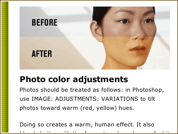
A coherent brand identity was further undercut by random visual variations between sections: one section might use three columns while another used four, and so on. Moreover, the sites reliance on photography submitted by disparate journalists unfortunately contributed to the lack of cohesion, impairing usability and further diminishing the brand, even though it brought home the urgent realities Amnesty tackles.
Solution: Brand enrichment
We gave the Amnesty brand its due by fearlessly promoting a limited palette of strong brand colors and by enforcing visual consistency across the sites varying sections via crisp templates and rules-based design. We also devised a method to bring visual consistency to disparate photographs, no matter where, by whom, or under what lighting conditions they were taken.
Problem: Bloat
Like most sites that have been around a while, Amnestys relied on outmoded, nonsemantic, bandwidth-intensive front-end markup that made the site inaccessible to some visitors and browsing devices, and also forced the site to take longer to load than it needed to.
Solution: Web standards
We gave Amnesty semantic, lightweight markup and clean CSS layout, thereby increasing accessibility while reducing bandwidth overhead and load times. Hey, its just what we do.
Our responsibilities on this project
All in all, the project included usability analysis and information architecture; UX design; limited content strategy assistance; graphic design; site design; template development; style guide development; CMS development; template loading; and testing. It was launched in September, 2004. Needless to say, the organization has redesigned several times since then.
Visit the archived site.

