Ground Control to Major Update: Redesigning UFA, Inc.
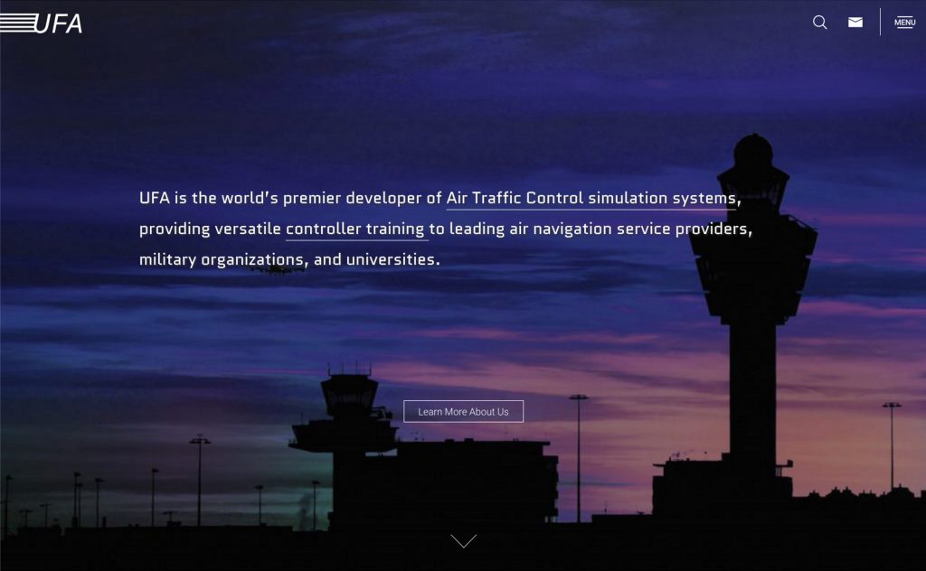


With offices and customers across the globe, UFA is the worlds premier developer of Air Traffic Control simulation systems, providing versatile controller training to leading air navigation service providers, military organizations, and universities.
While UFAs tech is second to none, when they came to studio.zeldman, their website wasnt doing all it could to tell their story and convey their strongest brand attributes. UFAs narrow, fixed-width site had not been updated in years, and it showed. In comparison to some competitors websites, UFAs appeared dated, which was not putting the best foot forward for a leading-edge tech company aiming to win new business and retain existing customers.
In this category, brand impression is everything. Good design creates impressions of quality and stability, hallmarks that customers find highly attractive. It also compels readers to spend additional time interacting with content. At its most basic level, then, our redesign had to firmly position UFA as the top-tier player it is, bringing coherence, elegance, and clarity to the site experience while conveying the companys brand attributes of cutting-edge tech and extraordinary engineering precision.
Narratives and navigation
UFA had news to share and stories to tell, but the old site buried this invaluable information on a sub-page, while the home page did little (via copy and photography) to tell UFAs story, position the brand, and invite key personas to take advantage of the sites offerings.
Our redesign went beyond simply surfacing news headlines on the home pageit actively romances that news. To accomplish this, we created a redesigned multi-level home page and news section, crafted to both orient the visitor and inspire exploration of news items. This involved providing breathing space and drama directly on the home page, while also creating a conversion funnel that begins qualifying potential customers the moment they engage with the sites content.
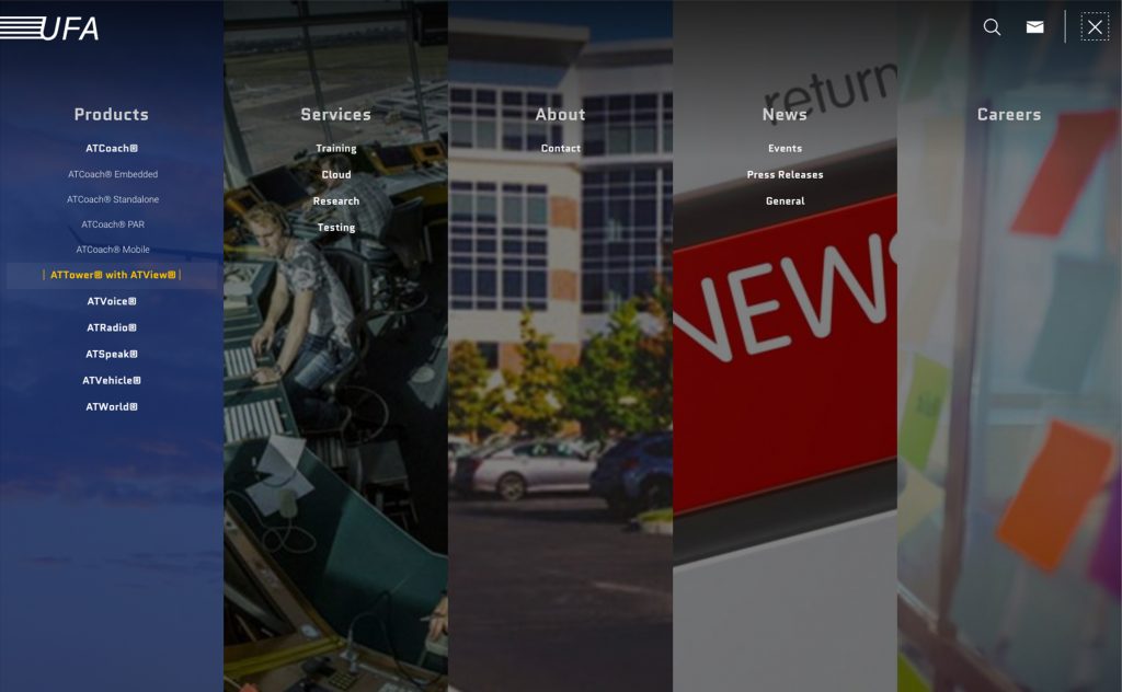
Stakeholder interviews and our own research told us that customers also had difficulty understanding the differences between UFAs sophisticated product offerings. To help address that concern, we applied a combination of updated iconography, a more focused copy platform, and revised site architecture, along with engaging imagery from UFAs own archives.
The design process
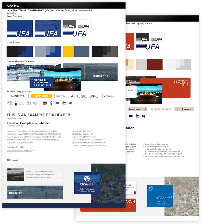
To move surely but also quickly, our design process avoided outdated waterfall methods in favor of quick prototypes and check-ins. For example, instead of expensive and time-consuming full-blown, multi-page Photoshop comps, we designed two style tiles emphasizing different brand attributes. At a glance, our client was able to easily choose the best design direction, and from there, the site was designed in the browsera method that is accurate, efficient, and appropriate for todays mobile-first, responsive web.
A platform for today and tomorrow
Because it was a studio.zeldman project, the site also had to work for pretty much any person, on pretty much any device, regardless of that persons or devices capabilities. Accessible, inclusive design built on a reliable architecture of semantic markup and progressive enhancement ensures that the new design will work as well in the future as it does today.
Additionally, we built a friendly platform via WordPress enabling UFA to not only easily update their sites architecture and content as their product offerings change, but to also share news with an engaged readershipempowering UFA to continue modifying the site with confidence, without fear of exceeding internal resources or needing to pay for external ones.
Lastly, we shaped the new sites architecture so as to help UFA qualify and begin converting good prospectsbecause a business site should do more than just look good and work well for everyone. It should be the organizations first salesman.
Our responsibilities on this project
Research; user experience design; information architecture; content strategy; interface design; front-end code; back-end development.